

What exactly is a logo, anyway?
- Dave Norris

- Jun 12, 2025
- 4 min read
What is a logo, anyway?A logo is basically your business’s face. It’s that little visual sidekick that pops up on everything you do — your website, your business cards, your invoices, your cousin's hoodie if you're lucky. But did you know there are seven different types of logos?
They all mix type and visuals in some way, but each one gives off a completely different vibe. And let’s be real: your logo is usually the first impression someone gets of your brand — so if you’re rolling with something you whipped up in a Word doc back in 2019, it might be time for a glow-up.
Here’s the lowdown on the logo types and how to pick the right one for your business (especially if you're finally ready to do this the right way).
1. Monogram Logos (a.k.a. Lettermarks)
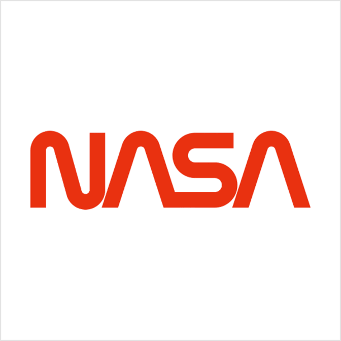
These bad boys are made up of initials. Think IBM, CNN, NASA. When your business name is longer than a CVS receipt, chopping it down into initials just makes life easier.
Lettermarks are clean, simple, and work great for businesses with long or hard-to-pronounce names. But heads up — the font really matters here. If you’re not a household name yet, you might want to sneak in your full business name underneath until people get the memo.
Best for: businesses with long names, or if your initials just look badass in a bold font.

2. Wordmarks (a.k.a. Logotypes)
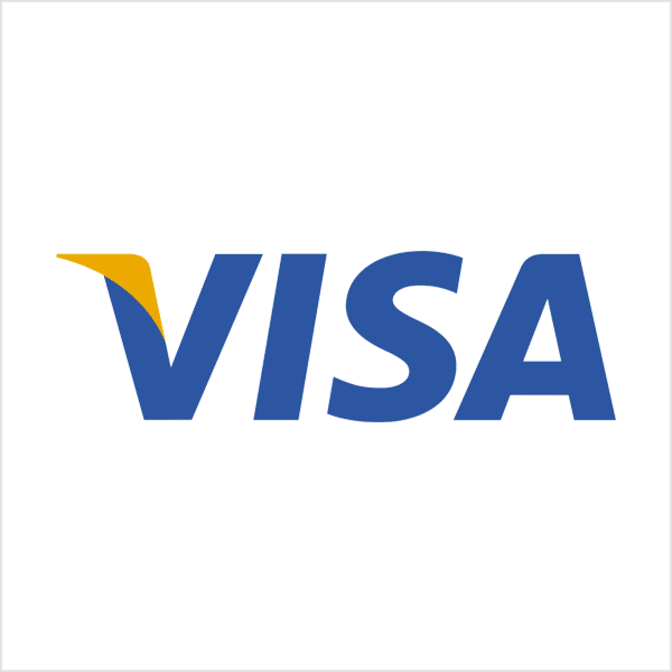
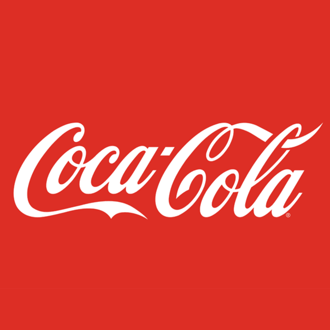
Similar to lettermarks, but instead of initials, you're rockin' the whole name in a stylized font. Think Google, Coca-Cola, or Visa. Wordmarks shine when your name is short, catchy, and you want it burned into everyone’s brain.
If you're just getting started and your name is unique or clever — this is a power move. Just make sure your font doesn’t scream “I downloaded this from a free site at 3am.”
Best for: new businesses trying to build name recognition, especially if your name is short and punchy.

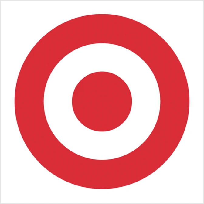
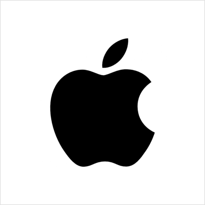
3. Pictorial Marks (a.k.a. Logo Symbols)
This is your classic icon-only logo. No words. Just an image. Apple’s apple, Twitter’s bird (RIP), Target’s bullseye.
These only work when you’ve got some brand recognition already or your symbol is spot-on with what you do. If your name is something like “Blue Mountain Tax Advisors,” maybe skip the pizza slice graphic.
Best for: brands with visual names or strong recognition — or if you’re playing the long game with branding.

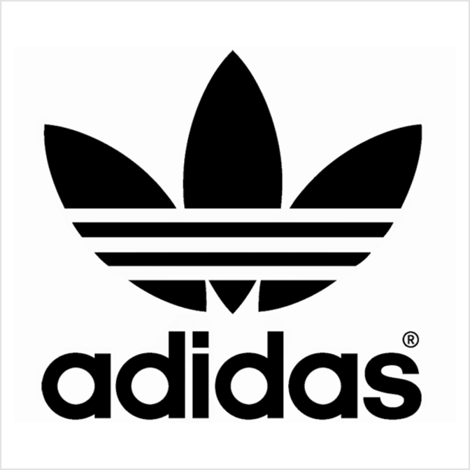
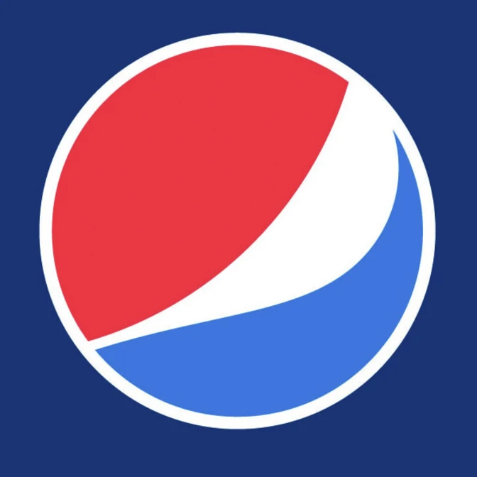
4. Abstract Marks
Now we’re getting artsy. Abstract logos are geometric or conceptual images that represent your brand — but don’t actually look like anything.
Pepsi’s swirl, Adidas’s stripes, Nike’s swoosh — you get the idea. They’re sleek, custom, and full of hidden meaning (or at least that’s what your designer will tell you).
Best for: businesses that want a unique, modern look without being literal. Also great if you’re global and want to avoid language barriers.
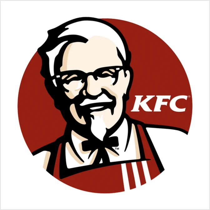
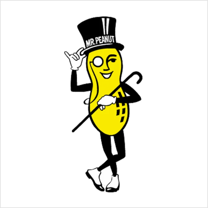
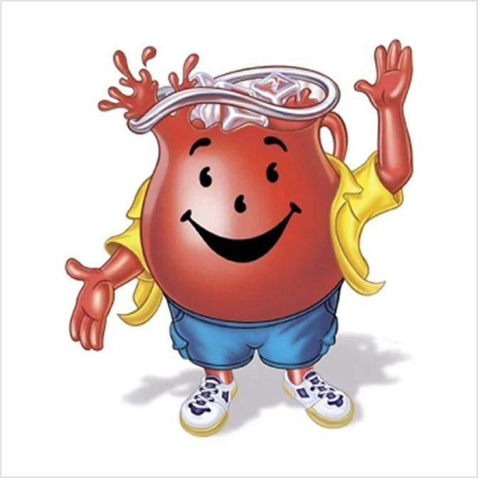
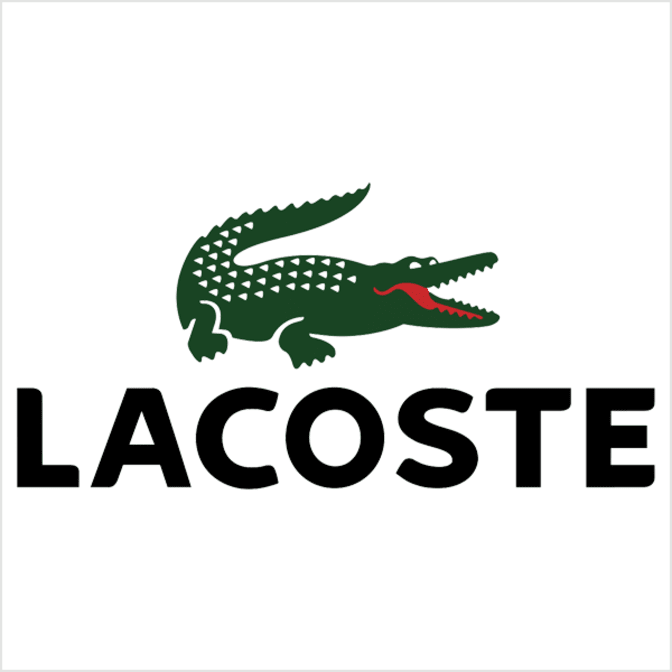
5. Mascots
Say hello to your new cartoon coworker. Mascot logos are full-on characters: think KFC’s Colonel, the Kool-Aid Man, or Mr. Peanut.
They’re fun, friendly, and create instant personality. Great if your brand is all about people, fun, and interaction. Bonus: they make killer social media content and event appearances.
But keep in mind — a complex mascot isn’t gonna look cute at 1-inch wide on a business card.
Best for: family-oriented brands, schools, food brands, or anyone who wants to inject a little fun into their image.
6. The Combo Mark
You get a logo! And a name! All in one neat little package.
Combination marks are the PB&J of logo design: a wordmark/lettermark + a pictorial/abstract/mascot mark. You can stack ‘em, line ‘em up, or blend them together.
This is a fan favorite because it’s versatile, easy to brand across platforms, and helps people associate your name with your image. It also gives you flexibility — as your brand grows, you might drop the text and just roll with the symbol.
Best for: almost every small business, especially if you’re looking for a long-term branding strategy.
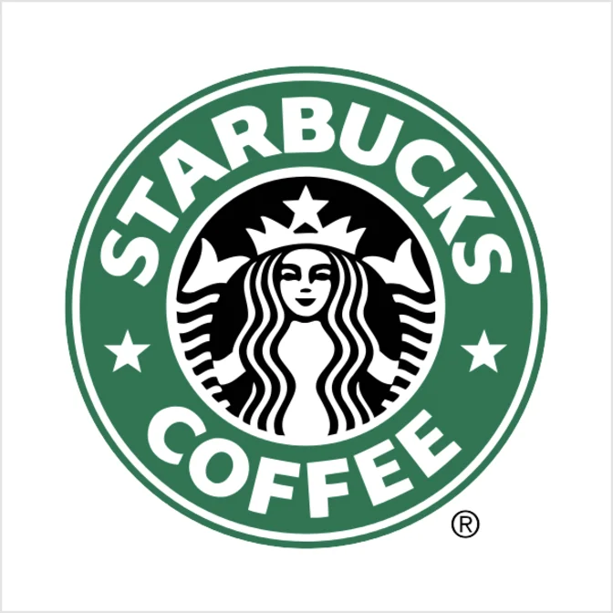
7. The Emblem
Fancy. Traditional. Sometimes a bit extra. Emblems are fonts tucked inside icons — think badges, seals, or crests. Great for schools, government, craft breweries, or anyone who wants to look timeless and legit.
But be careful: detailed emblems can be a pain to print or shrink. That beautiful intricate crest might look like a smudge on a polo shirt.
Best for: businesses with heritage, tradition, or a vintage edge. Just keep it clean and simple enough to scale.

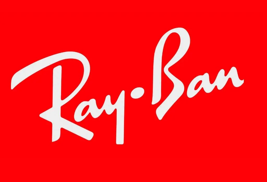
8. Signature Logo (a.k.a. Handwritten Logos)
Now we’re getting fancy — or artsy — or both. Signature logos are exactly what they sound like: your logo looks like a handwritten signature. Think of Walt Disney’s iconic scrawl or the swoopy sass of a Chanel or Ray-Ban logo.
These logos scream personal brand. They’re stylish, custom, and give off serious “this brand is a vibe” energy. They work best when your business is tied to you — like a boutique, a photographer, a coach, an artist, or any service where your name is the magic.
But here’s the thing: not everyone has a name that looks beautiful scribbled out. (No offense, Kevin.) The style, weight, and fluidity of the type need to feel intentional — not like you signed a check with a Sharpie while running late to lunch.
Best for: personal brands, creatives, influencers, and businesses where your name is the brand. Also great for adding elegance or flair to your identity.
Pro tip: Even if you're not naming the business after yourself, a signature-style logo can still bring a boutique, high-end feel to the brand. Just don’t confuse “handwritten” with “messy.” We’ll make sure it reads as polished, not preschool.


So… which one’s right for you?
Here’s the breakdown:
Got a long name? Lettermark.
Short, catchy name? Wordmark.
Got a killer icon idea? Pictorial or Abstract.
Want to stand out and have fun? Mascot.
Need the best of both worlds? Combo mark.
Going for timeless and official? Emblem.
If your current logo falls into the “my nephew made this in Microsoft Paint” category, don’t sweat it. Most small businesses start there. But if you're ready to actually level up and look like the badass brand you are, we’ve got your back.
Let’s build a logo you’ll actually want to plaster on your trucks, t-shirts, tumblers, and tattooed across your bicep (okay maybe not that last one… unless you’re really committed).
👉 Hit us up. We’ll figure out what fits your brand and make sure your logo isn’t just “meh” — it’s memorable.


Comments